← All work
Backed by EWOR · 2026 · AI · 0–1

1Soul

An AI that lives in your WhatsApp and learns how you actually are in a relationship.

The only designer on the team. I work with the CEO on what the product is, and I own the front end on my own.

EWOR is Europe’s most selective founder fellowship, run full-time by unicorn founders who have built companies worth over €12 billion, SumUp and Adjust among them. It takes about 35 people a year out of more than 35,000 applicants.

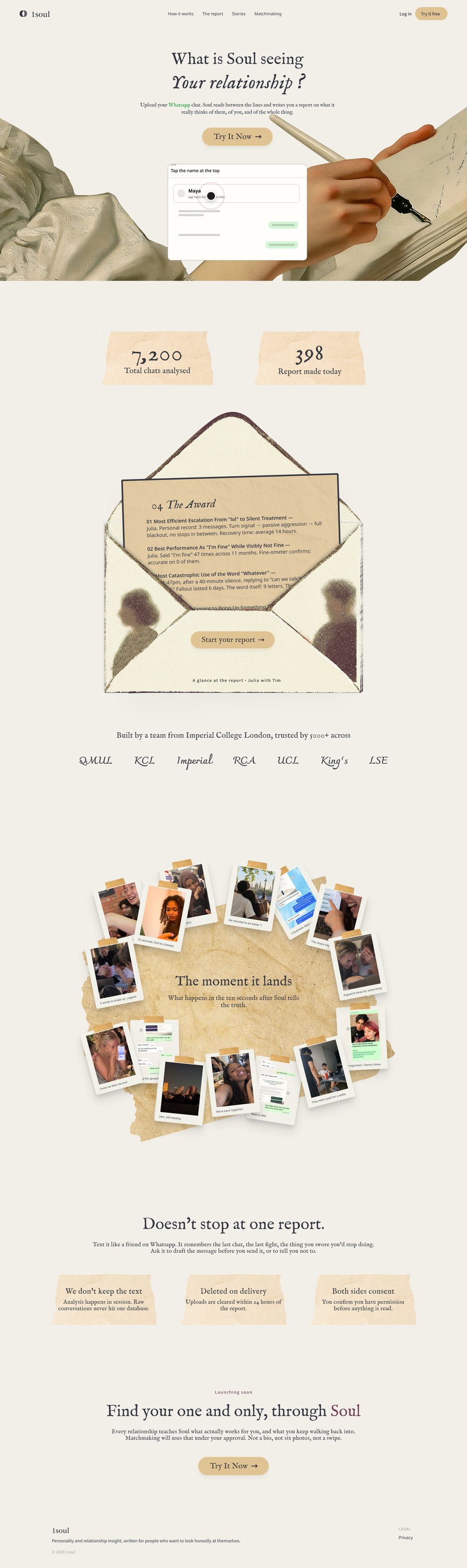
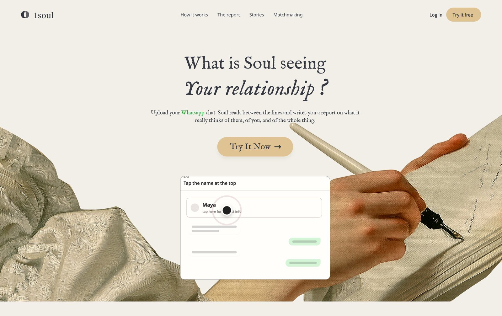
The 1soul.ai homepage. A headline reading 'What is Soul seeing. Your relationship?' over an illustration of hands writing with a quill on parchment
1soul.ai now. I designed and built the front end.

The product is a ladder with three rungs. Understand somebody. Find them a good match. Bring the two of them together in real life.

I have worked on it twice. Both times the job was the same. Work out which rung had broken, and rebuild that one.

5,000+people using it now, across seven London universities.
+25%female sign-ups after I rebuilt the site around one audience.
3×users over the same period.

The short version. The first time, the top rung was broken: women were signing up and staying away from the events. I rebuilt the site and the mechanic around one audience, and female sign-ups went up 25%. The second time the first rung turned out to be too soft to stand on, so the CEO and I went back down to build it properly. The product now asks you for a real conversation and writes you back.

What 1Soul is

1Soul is a relationship AI that lives in your WhatsApp. You talk to it the way you talk to everybody else, it learns who you are from that, and when it has read enough it brings you and somebody worth knowing into the same evening. Romantic first, and friendship and work after that.

Getting there takes three things, in this order, and each one asks the person for more than the one below it.
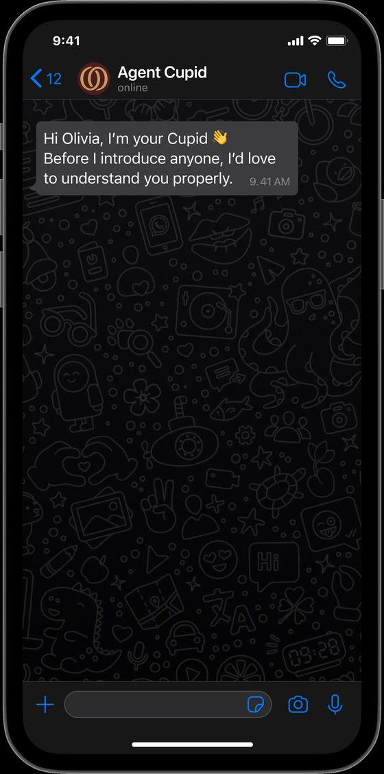
A WhatsApp conversation. Soul opens by saying it would like to understand her properly before it introduces anybody
Rung 1Understand somebody
She has to believe

Giving this thing my real conversations is safe
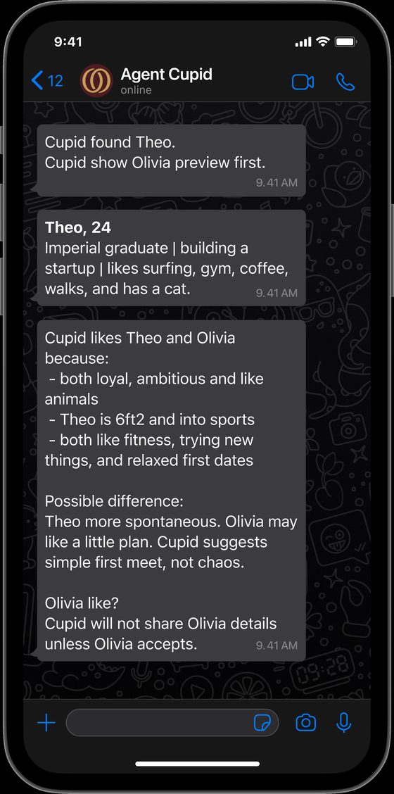
Soul showing a short preview of a match, a few details at a time, and saying it will share nothing of hers unless she accepts
Rung 2Find them a good match
She has to believe

This AI’s judgement is worth listening to
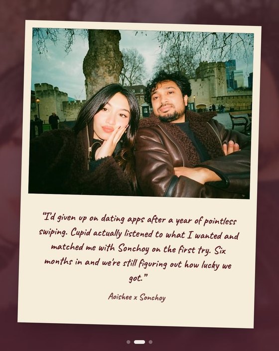
A Polaroid of a couple who met through 1Soul, with their own words written underneath it
Rung 3Bring them together in real life
They both have to believe

A 1Soul event, or a meeting we arrange ourselves, is somewhere I can trust

What I do here

I am the only designer here. I work with the CEO on what the product is and how it should feel, and I own the front end on my own, from the positioning through to the conversion number at the end of it.

I stay with a decision all the way down. Positioning, the design that carries it, the build, then watching what people do with it and changing it.

Round one: the top rung was broken

Round one is about the handover from rung two to rung three. People were being matched, and then staying home.

At the early events the split ran nine men to every woman. The sign-ups existed and the room stayed empty, and the site was the reason. Research called it a heavy magic book. It promised that an AI would date on your behalf, which is the one claim a woman deciding whether to walk into a room of strangers will not take on trust.
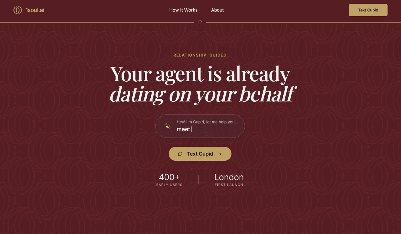
The original 1Soul homepage. A dark wine-red hero with the headline 'Your agent is already dating on your behalf'
What I inherited. Framed around the AI acting on your behalf, which is exactly what people did not believe.
What research said, and the comment it started from

Bumble's founder announced that AI would take over the swiping. The comments under that post were the most useful research I did here.
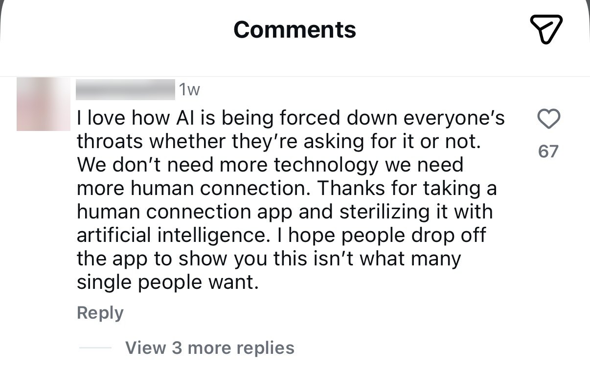
A screenshot of one Instagram comment, with the commenter's name and profile picture blurred out. It reads: 'I love how AI is being forced down everyone's throats whether they're asking for it or not. We don't need more technology we need more human connection. Thanks for taking a human connection app and sterilizing it with artificial intelligence. I hope people drop off the app to show you this isn't what many single people want.' It has 67 likes.
One of the top comments, 67 likes.
33% vs 17%
Women expecting AI to affect them negatively over twenty years, against a positive effect. Among men it is close to even.Pew Research Center, 5,119 US adults, February 2026

People hand AI their calendar and their inbox. Romance is where they most want the other person to be real, and that gap is the design problem.

Our own users said the same thing about the old site, in their own words.

🧑
"It looks like a heavy magic book."
🧑
"I can't tell where this service even comes from. It feels suspicious."
🧑
"It looks like AI is dating for me. Isn't this just Black Mirror?"

Reading the comment properly

The objection is specific. She does not say the technology fails. She says it was forced on her, and that it sterilises the one thing she came for.

So the split holds up at scale. Women rarely object to the technology in principle. They are quicker to read it as a risk placed on them, and in dating, where the stakes are personal safety, that gap gets wider. My read was two-sided. There is a real opportunity for AI here, and the same evidence is a warning about how to enter. The job is to leave people room to feel in charge, so the AI never reads as something being done to them.

How people arrive

Then I watched how people arrive. Women join a dating app because it makes them feel good. Men join because women are already there.

The order matters, and most products have it backwards. Pull in a lot of men and you get volume with no retention. 1Soul is for serious connection, so we build for women first. The men come on their own after that.

So I set the positioning before anything was drawn. 1Soul is built for the university woman who wants something serious, and the product has to prove that in the first interaction. She is a student, so she lives inside a small world of shared campuses and mutual friends, and she has more to lose socially if an introduction goes wrong. That shaped everything after it.

The market I was designing into

I looked at the dating apps people already use.

Tinder Bumble Hinge

Most run at six or seven men to three or four women, and that gap shapes everything else. Men send a lot of messages and get nothing back. Women open the app buried in messages from strangers. It gets worse for both sides, and the ratio keeps getting worse with it.

6–7 men 3–4 women
In every ten people on these apps, six or seven are men.

The three patterns I pulled out of the comments

  • The strongest backlash was to any language implying AI replaces or handles the relationship itself. The "AI dates AI, then you meet" framing was rejected even by people who liked the underlying idea.
  • The second-strongest concern was privacy and deepfakes. Users asked directly how their photos would be protected, a trust gap the competitor's own page never addressed.
  • One notably positive comment confirmed the mechanic was welcome: AI narrowing the field before a human commits time. The problem was the wording.

The same Pew survey found 68% of women say AI is moving too quickly, against 58% of men. A separate study of around 3,000 people in the US and Canada found women rate AI as riskier, and traced it to higher general risk aversion and greater exposure to the jobs AI disrupts first.

User interviews

Eight in-depth interviews with the target audience, London university students, current and lapsed app users, and heavy users of the apps they had left. I ran and wrote up every one of them. AI clustered the transcripts by problem type, which surfaced eight areas. The top four:

  • Brand tone: the site read as "dark" and "mysterious," more like a spellbook than a dating product, undercutting the fact that it's built for serious daters
  • Unclear audience: is this for students only, or everyone? The "Connecting students at…" module was described as confusing
  • Trust & safety, especially for women: one participant was uneasy that a match arrived with a name but no photo or shared context, and said she would never accept an AI-scheduled meeting without a conversation first
  • AI credibility: participants were curious what Cupid actually does (chat with you? pick the venue?) but the product didn't say

What I wrote because of it

This went straight into the words on the page. Three lines, written to take the edge off a woman's guard about AI coming into her love life.

Be seriously matched, not just casually seen.

Cupid helps match; you decide to love.

Cupid works all that in the background, you stay in the foreground to love.

Each one puts Cupid behind the person. It finds and it narrows, and the person is still the one doing the loving. That is the line I did not want the product to cross in its own copy.

The mechanic I changed

So I rebuilt the site around one audience, the university woman in London who wants something serious, and I designed the mechanic to match. I took the shape from Secret Santa. You know your match is in the room, you get one small hint, and you decide when to open it.
?
Every gift already has a name on it.
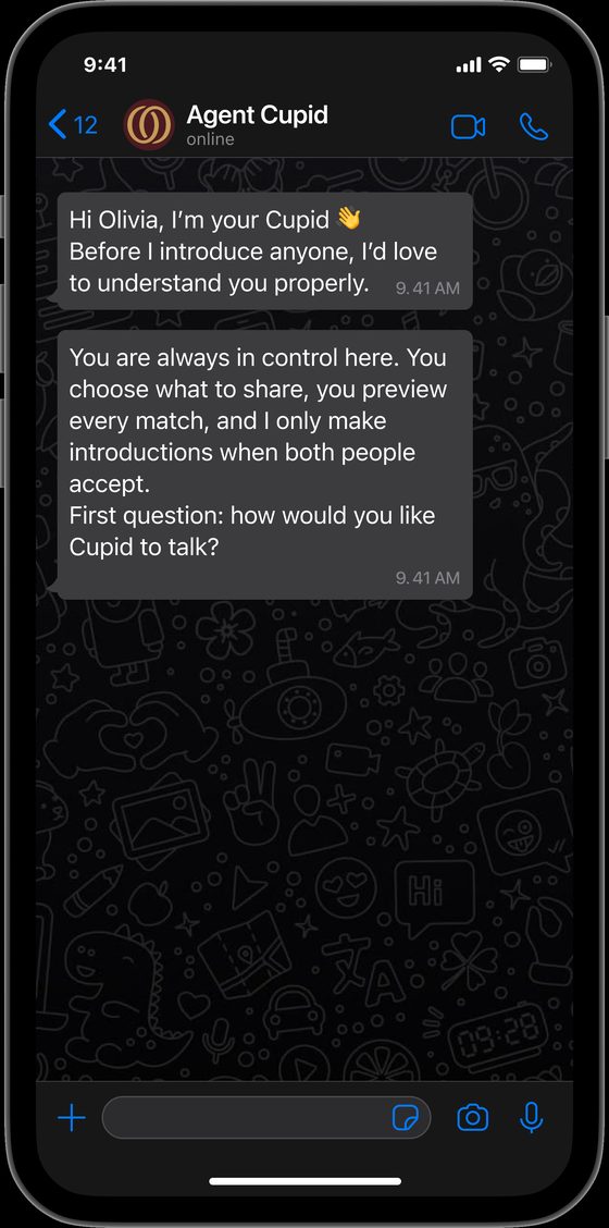
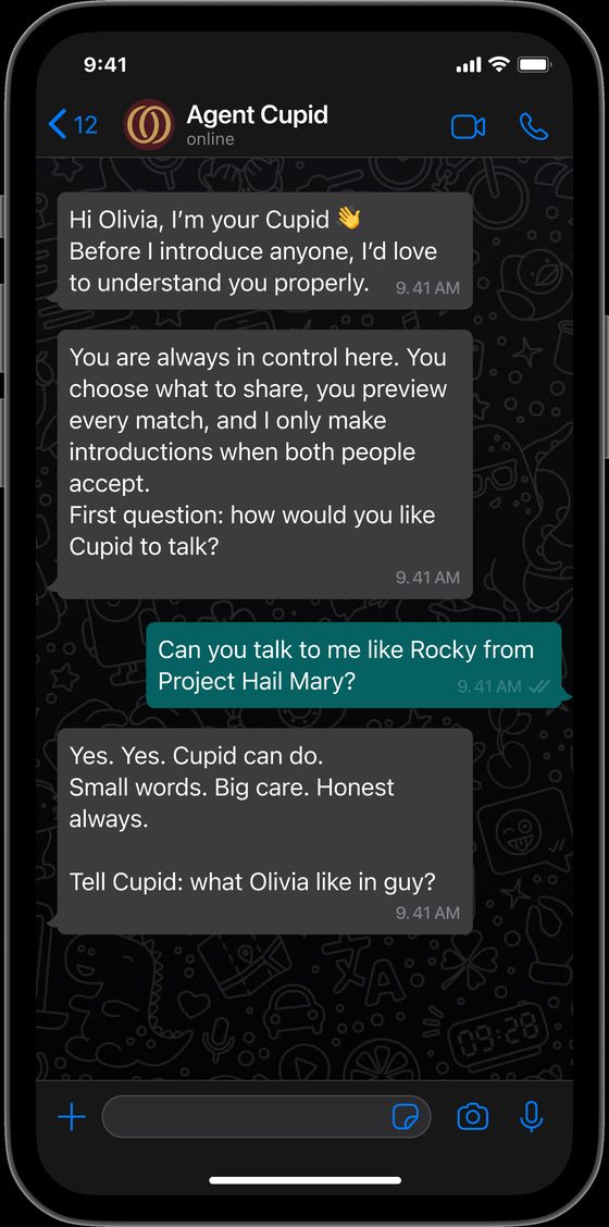
A WhatsApp conversation. Agent Cupid writes: Hi Olivia, I am your Cupid. Before I introduce anyone, I would love to understand you properly.
Cupid opens by asking about her.
Agent Cupid explains that the user is always in control, chooses what to share, previews every match, and that introductions only happen when both people accept
It says what it will and will not do, before asking for anything.
Olivia asks Cupid to talk to her like Rocky from Project Hail Mary, and Cupid answers in that voice: small words, big care, honest always
She sets how it talks to her.
Cupid shows Olivia a preview of a match called Theo with a few details, and says it will not share Olivia's details unless Olivia accepts
A match arrives as a clue.

What Cupid says before it asks her for anything.
The screens I drew for it, and why they are like that

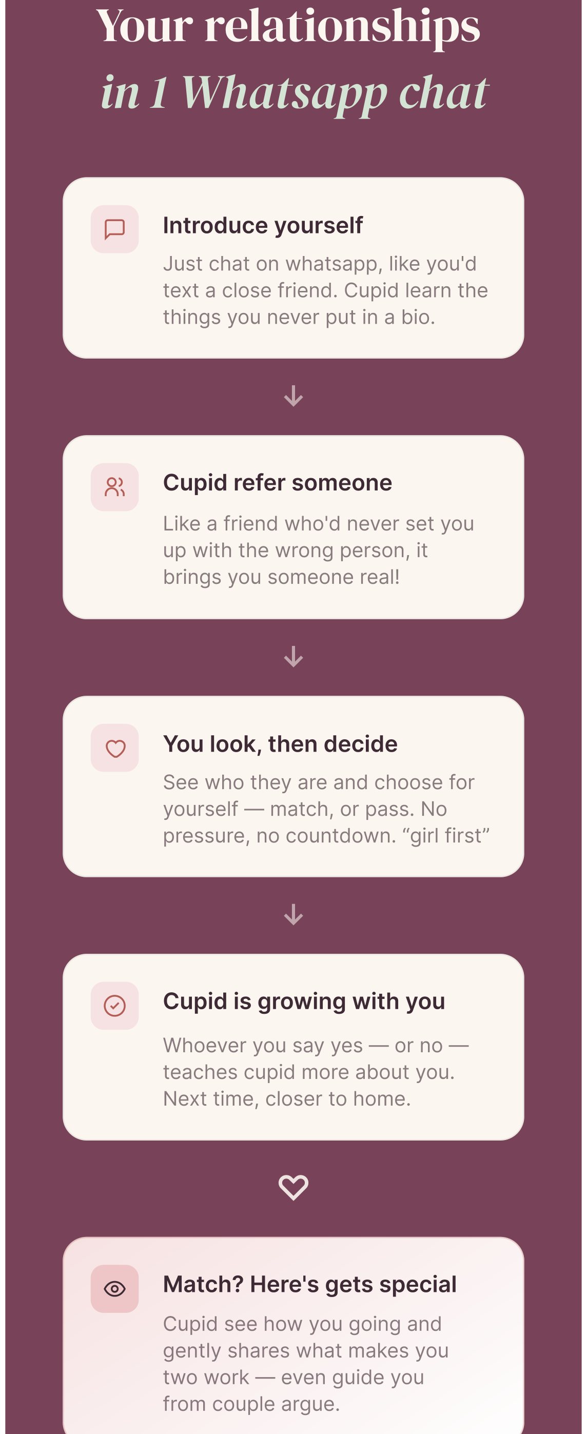
The rebuilt site's flow section, headed 'Your relationships in 1 Whatsapp chat', with five stacked cards: introduce yourself, Cupid refers someone, you look then decide, Cupid is growing with you, and match
I drew the four steps on the page. People kept asking what Cupid actually does, and the old site had never said. Each card names one thing it does and one thing she keeps. "You look, then decide" is doing the most work of the five.
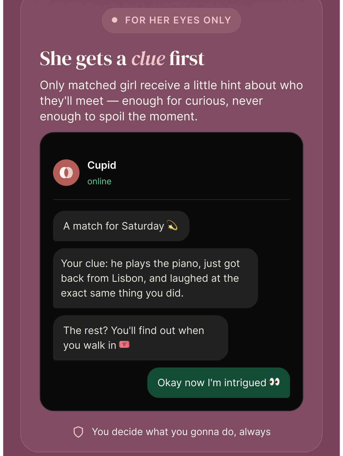
The section headed 'For her eyes only, she gets a clue first', showing a WhatsApp conversation where Cupid sends one hint about a match and she replies
The clue became something you could read before you ever opened WhatsApp. "You get a clue first" is a sentence nobody believes on its own, so the section is the actual message she would receive. The line under it reads YOU DECIDE WHAT YOU GONNA DO, ALWAYS.
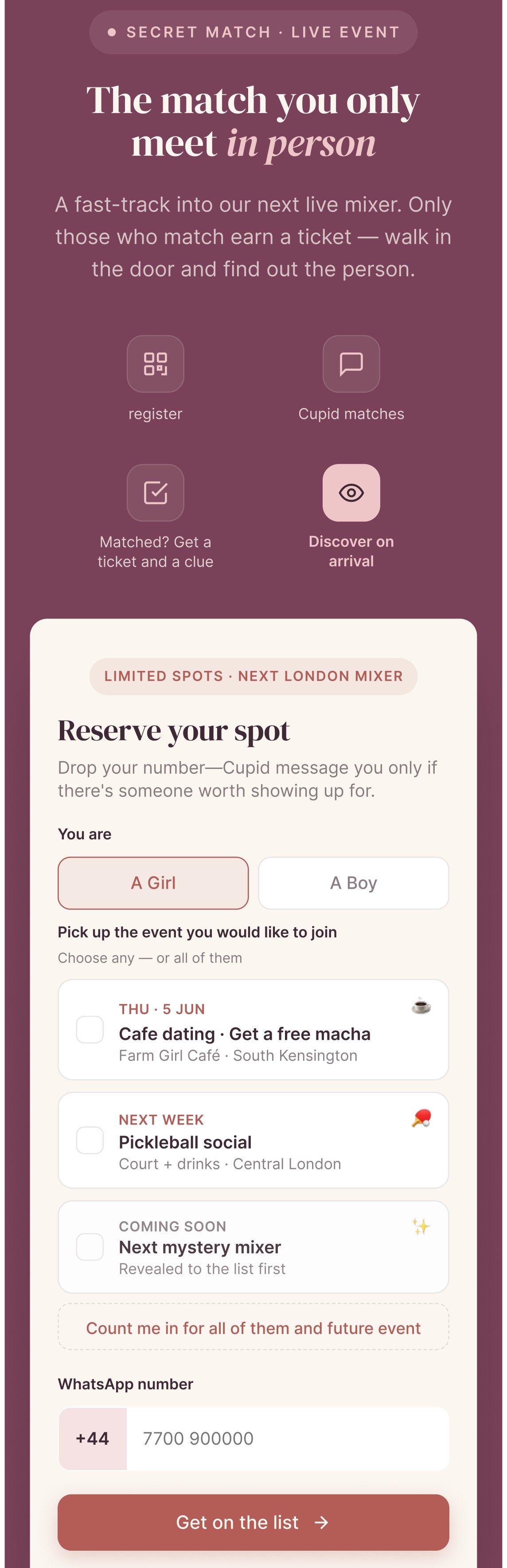
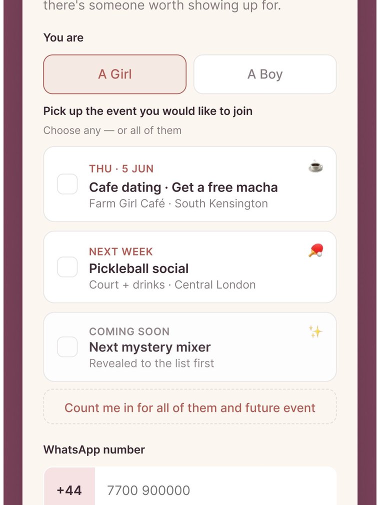
The Secret Match section: four steps from register to discover on arrival, and a form to reserve a spot at a London mixer with a choice of events
The room got a booking flow of its own. She picks which evening she wants, a matcha café or a pickleball social, and gives a number. The events are named and dated because a woman deciding whether to walk into a room wants to know what the room is.
How the mechanic works, step by step

Why Secret Santa was the right shape

It happens in a safe place

You are in a room with people you already trust. The setting does the reassuring before anything is opened.

You know one of them is yours

Your name is already on something. That certainty is what lets you enjoy the waiting.

You get a clue, and you decide

One small hint, and you choose when to open it. Nobody opens it for you.

A dating app hands over the whole profile at once: the photo, the name, the hobbies. Then it asks a woman to judge a stranger off that card, and to go and meet him in person. She gets all of the surface immediately, and none of the depth. Secret Santa suggested another way in. Set it somewhere she already feels safe. Give her a little. Let her stay curious, and let her work out for herself which one is her Santa. The decision stays hers.

Research backed it. Women hold back from putting their own information out, photos most of all, and they will not let an AI date on their behalf. Being handed a finished answer feels like being managed. They want more real information about the other person, then the choice. Men are far more relaxed about showing themselves. The same feature lands in two different places, and the design has to hold both.

Slowing the first interaction down only works because of what 1Soul is for. Someone who wants something serious will wait for one good introduction. Someone who wants to swipe goes elsewhere, and that is fine.

01
Cupid finds a match
Narrowed from the pool using her stated preferences; she never sees a queue of profiles to swipe.
02
She gets a clue first
One specific, human detail on WhatsApp: enough to build curiosity, and short of spoiling it.
03
She reviews, at her pace
The clue sits with her until she is ready. She replies in her own time.
04
She decides, always
Confirming the meeting is explicitly her call, and the product says so in words.

How it runs: online first, then a room

Everyone starts in the same place. A man or a woman talks to Cupid, Cupid works out who suits them, and both sides get a match. If they want to take it further, we place them at a real event, something like a matcha party. Everyone in the room is a London university student, so the setting already carries trust a stranger meeting never would.

The room runs like Secret Santa. Everyone knows their match is there and nobody is handed a name. The woman gets the richer clue. She knows more about him than he knows about her, and she is the one who can move first. So she can watch the room, start the conversation when she is ready, or not at all. He cannot open a queue and he cannot skip ahead of her.

Deciding what got built first

I wrote the feature list and I ordered it. This covers the people who sign up online and want to come to the group events offline. Not everything could ship, so I ranked each feature against one question: does this make the first interaction feel safe for her?
  • Clue first. Highest priority. It is the mechanic, so nothing else mattered until it worked.
  • One match at a time. High. A queue would have undone the whole positioning, so we never built one.
  • She sets the pace. High. She replies in her own time, because urgency is what makes these products feel unsafe.
  • Profile depth for men. Lower. Men were not the constraint. Adding more for them first would have cost us the thing we were solving.

The interface I changed

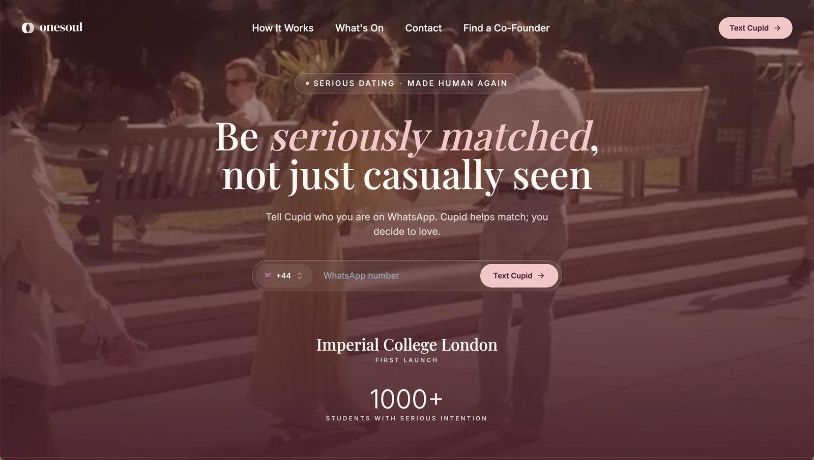
The rebuilt onesoul homepage. Two people on a bench under a plum overlay, with the headline 'Be seriously matched, not just casually seen'
The first rebuild. The AI moved into the background and the person came forward.
The rest of that redesign, screen by screen
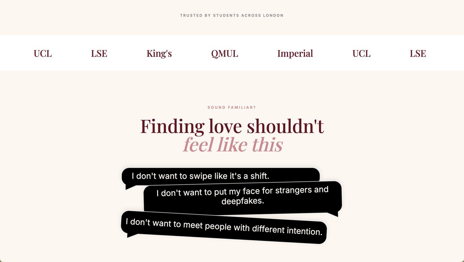
A section of the redesigned site: a row of London university names, then the heading 'Finding love shouldn’t feel like this' above three dark speech bubbles quoting what people said in interviews
Her own words, before any claim of ours. The three bubbles are quotes from the interviews, unedited. Somebody who has left a dating app arrives braced for another pitch, so the page names the thing she is tired of first and earns the right to speak second. The university row above it is doing the same job: this is a room of people like you.
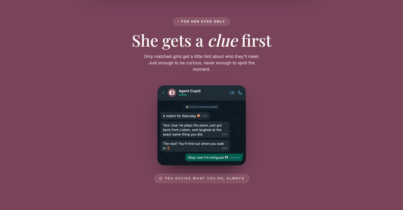
A section headed 'She gets a clue first', with a WhatsApp conversation showing Agent Cupid sending one small hint about a match
The mechanic, shown as itself. "You get a clue first" is a sentence people take on trust or they do not, so the section is the actual message she would receive. The label above it reads FOR HER EYES ONLY and the one below reads YOU DECIDE WHAT YOU DO, ALWAYS, because the two things she has to trust are that it is hers and that nothing happens without her.
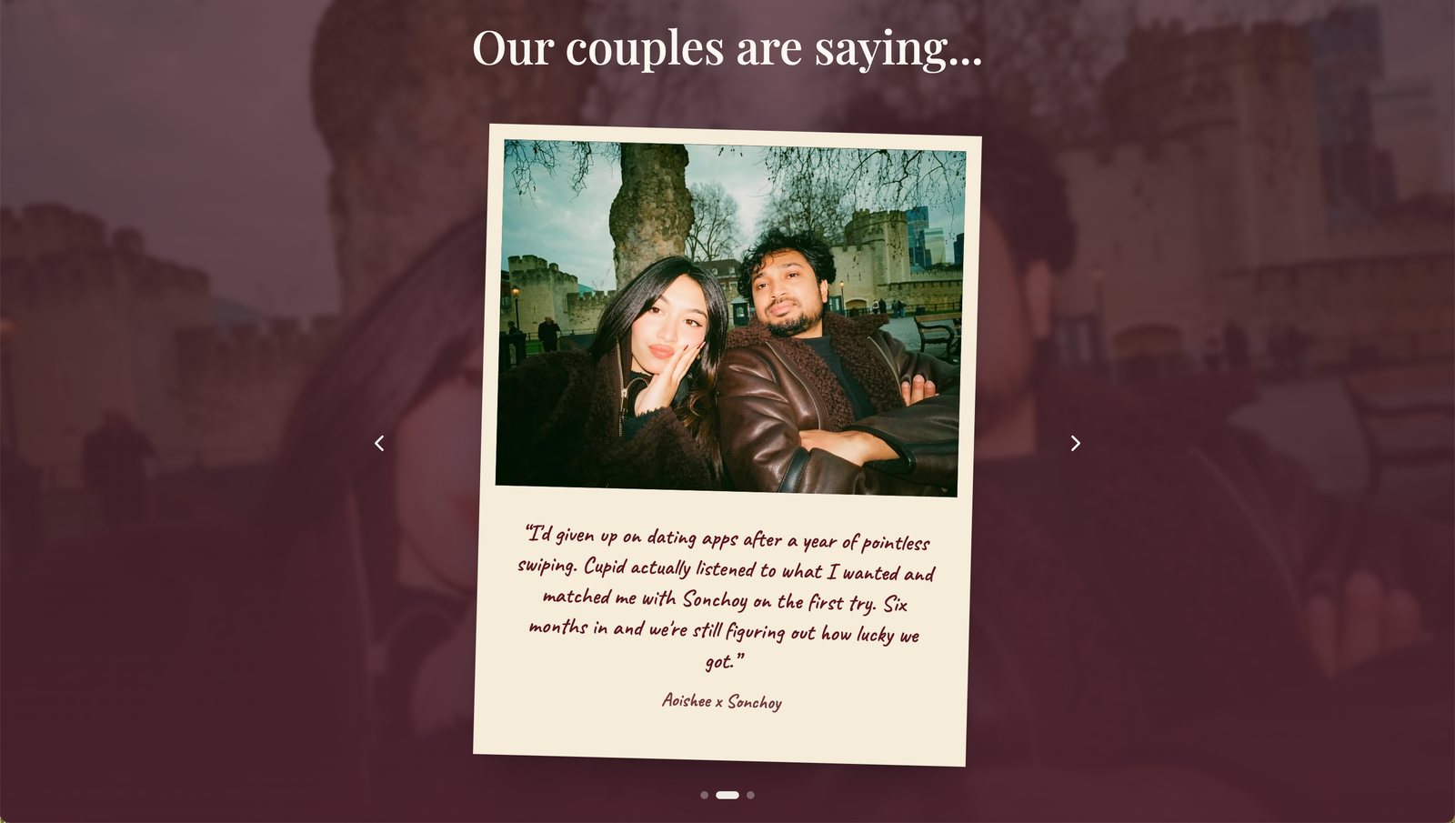
A section headed 'Our couples are saying...' showing a Polaroid photograph of a real couple with a handwritten quote underneath
Proof that looks like a photograph. A five-star card would have read as marketing. A Polaroid of two people who actually met, with their names on it, is the format people already trust from friends. This is the pattern I took further on the current site, as a whole wall of them.
Near-black, wine and gold were what research called a heavy magic book. Blush and plum took over, because romance was what the product was actually selling.
The colour system
#D4E5D5
Sage
Calm and grounded. It took over from the old gold accent, which people read as mystical.
#F0C7C8
Blush
Used at the trust and safety moments, where the page has to feel soft.
#B35D57
Terracotta
Carries the human warmth into buttons and highlights.
#794359
Plum
Reads as serious. The old palette got called a spellbook, and this replaces it.
#4A222E
Deep wine
Gives the page depth while staying open and readable.
#FBF7F1
Cream
The new base colour, in place of the old near-black backgrounds.
#242220
Near-black
Kept as the anchor neutral. It now sits alongside the warm tones.

The rebuilt colour system: sage, blush, plum and wine in place of the old mysterious near-black and gold, directly answering the "spellbook," "untrustworthy" and "too heavy" feedback from research.

Every other decision in this rebuild, and what people said that caused it
  • Near-black and gold gave way to cream, sage, blush, terracotta, plum and wine. Women in research called the old site a heavy magic book, a spellbook, too heavy. The whole colour system went warm because of those three words.
  • A warm photograph of two people replaced the dark, mysterious hero. The old image read as a party or a séance. It never said who the product was for.
  • Imperial, UCL, LSE, King’s and QMUL replaced “the world’s first Relationship Infrastructure”. Nobody I interviewed used a word like infrastructure. People believe what they can check, so I led with the names they already know.
  • “You choose who to meet, and when. Always.” went on the page as words. A promise about trust has to be readable. Implying it does nothing.
  • The deepfake worry got a section of its own, in the words people used in research. It was the first thing women raised and the old site had no answer to it.

The whole of that version, as it shipped.

The complete first rebuild, top to bottom: the warm hero, the London university names, the pain points in her own words, the four-step flow, the Cupid conversation, the couples, the Secret Match event booking, the clue, and the closing invitation
onesoul after the first rebuild, top to bottom. Scroll inside the frame. I designed it and built the front end.

What came of round one

It worked. Female sign-ups went up 25%, users more than tripled, and at one event the women outnumbered the men for the first time. The room stopped being nine to one.
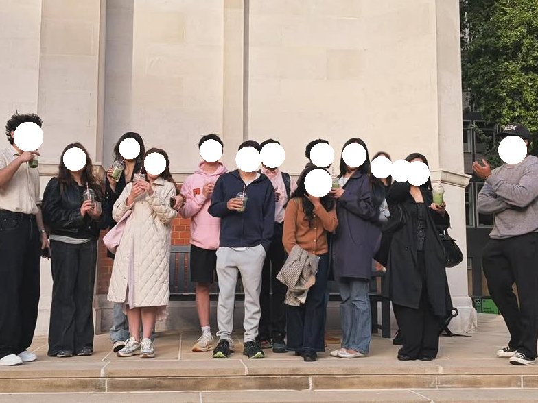
A group of students standing on the steps of a London university building holding matcha drinks, faces masked
A matcha party in London.

I ran the growth work alongside it.

Growth and content

Content planning for social

I wrote the video concepts and decided what each had to do. Some showed the mechanic, because "you get a clue first" needs showing. I also set what we would never post: nothing resembling a swipe queue, and nothing that promised a match.

The biggest rule came from watching the Bumble post fail. We kept the talk about AI to a minimum. Leading with the technology is what set people off there, so our posts lead with the people and the evening and let Cupid stay in the background.

The rest of the role

I worked on early growth as well. I ran an on-the-ground content strategy, which meant street interviews at London universities, timed so the filming and the sign-ups happened on the same day. I also wrote the playbooks for Instagram and TikTok, so each platform had its own plan.

Round two: the first rung was not solid enough to stand on

Round two is rung one. Understanding somebody deeply enough to be worth trusting, and building the trust that makes it possible.

Clarity said the funnel was healthy. 5,503 sessions over ninety days, 83% of the page travelled, conversion where it should be and users growing steadily. On paper there was no reason to stop.
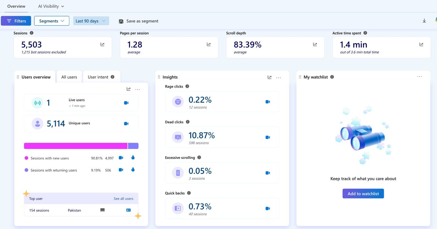
The Clarity overview: 5,503 sessions, 1.28 pages per session, 83.39 per cent scroll depth, 1.4 minutes active out of 3.6 total, with an insights panel listing rage clicks, dead clicks, excessive scrolling and quick backs
Ninety days of it. Healthy, and beside the point.

The events said otherwise. People signed up and never turned into a room. At the start all we asked for on WhatsApp was a handful of questions, and a dozen messages hold almost nothing of a person. So we knew them only in part, the matches we made were not good enough, and no couples came out of them. We were introducing people who barely knew each other, out of a pool far too small to choose from. The first rung was carrying all the weight above it and it could not take it.

Rung 1

Understand somebody

The second rebuild serves this one
Rung 2

Find them a match

Rung 3

Bring them together in real life

The first rebuild served this one

The CEO and I agreed on the order. Build the first rung properly, get real depth on each person, then go after volume. Accurate matching comes out of those two and cannot be had before them.

What the product became

Each version changed because of something we had got wrong, and the three homepages show it.

What I inherited
The original 1Soul homepage, dark wine and gold, headlined 'Your agent is already dating on your behalf'

An AI that dates on your behalf.

  • Nine men to every woman in the room.
First change
The rebuilt onesoul homepage, plum-toned, headlined 'Be seriously matched, not just casually seen'

Changed because nobody believed it, women least of all.

  • Female sign-ups up 25%. Users tripled.
Second change · now
The current 1soul.ai homepage, cream paper with a quill illustration, headlined 'What is Soul seeing. Your relationship?'

Changed again because a dozen messages hold almost nothing of a person.

  • A conversation you upload, a letter you get back.

The third one asks for something much bigger and gives something much bigger back. You hand over a real conversation, Soul reads all of it, and it writes you back.
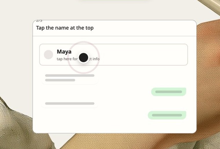
The same three questions, answered twice

The old way in: Soul introduces itself on WhatsApp and starts asking her questions about herself The new way in: a card on the site showing how to export a WhatsApp conversation and hand it over
The way in. The old product befriended you on WhatsApp and asked you to describe yourself, question by question. The new one asks you to share a conversation you have already had.
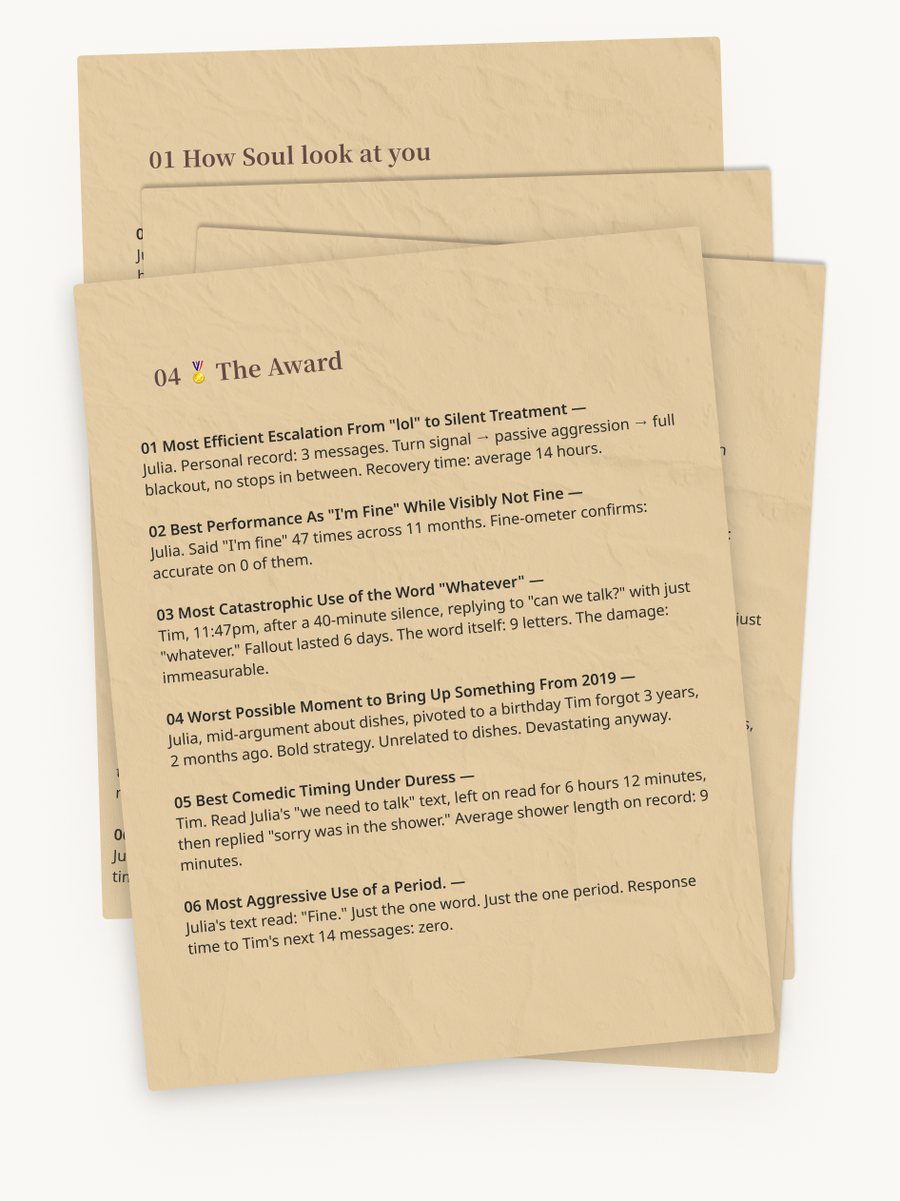
The old return: a match preview arriving on WhatsApp The new return: a written report on aged letter paper
What it gives back. The old product returned a match straight away. The new one returns a written report about you and one other person. The match comes later, after it has read enough to have a view worth acting on.
The old span of attention: choosing which single evening to come to The new span of attention: a section saying it does not stop at one report and you can keep texting it
How long it holds you. The old product was one evening, fifteen minutes of it. The new one is always working out who you are, because you text it like a friend and it keeps the last conversation, the last argument and the thing you cannot decide, and reads your pattern out of them.

The first attempt at it failed

I built it in the palette we already had, because keeping the brand consistent was the argument. On its own terms it worked.

Scrolling the version that did not ship: a dark, dimly lit hero, the three-step explanation on a near-black background, a sealed envelope, the report, and the closing matchmaking section
The version that did not ship. Consistent with the brand, wrong for what the page was asking.

Testing said no. I ran it with five people, putting our page next to an AI product with a clean, plain style and asking them to choose. The colour was good at mystery and romance. It was wrong for the thing we were now asking them to do. They called the tone and the site too serious, and every one of them picked the cleaner style.

So I stopped holding the old palette exactly and grew the system out from it instead. Parchment, a letter, a report you open. It points at the last time people got to know each other slowly, by writing, and it lets something invasive arrive as something intimate and worth trusting.

The second change, in colour. Blush and plum were right for being introduced to somebody. They were wrong for a page that reads your relationship back to you, so the whole thing moved onto paper and ink.
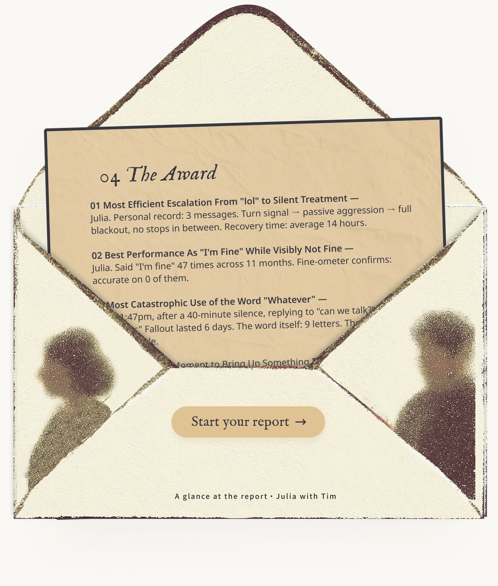
An opened envelope with a report card sliding out of it, headed 'The Award', listing observations drawn from a relationship's messages
The report arrives as a letter you open. The names in it are sample data, written to show the format.

The report

It arrives as a link, so it opens on a walk home or at two in the morning and travels into a group chat on its own. Then it opens as paper.
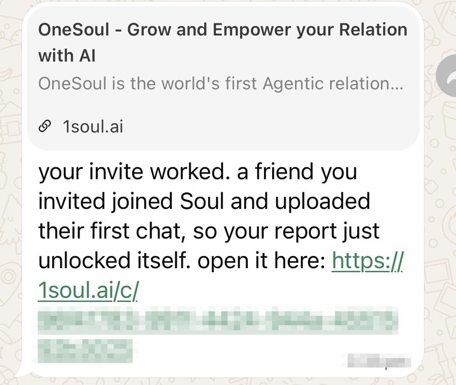
A WhatsApp message saying a friend you invited has joined and uploaded their first chat, so your report has unlocked, with a link to open it
It arrives as a link, in the place you already are.
The report as a stack of aged letter pages. The top one is headed 'The Award' and lists observations drawn from a couple's messages
Then it opens as paper. The Award page is the one I enjoyed most, and the names in it are sample data.

I never ask anybody for their data. I ask whether they want to know what Soul thinks of their ex. The conversation arrives because somebody is curious.

What people did on the page, and what I changed because of it

The first version moved on what people said in interviews. From the first rebuild onwards I had Clarity running on the site, so the second version moved on what people did, and that turned out to be the sharper instrument.
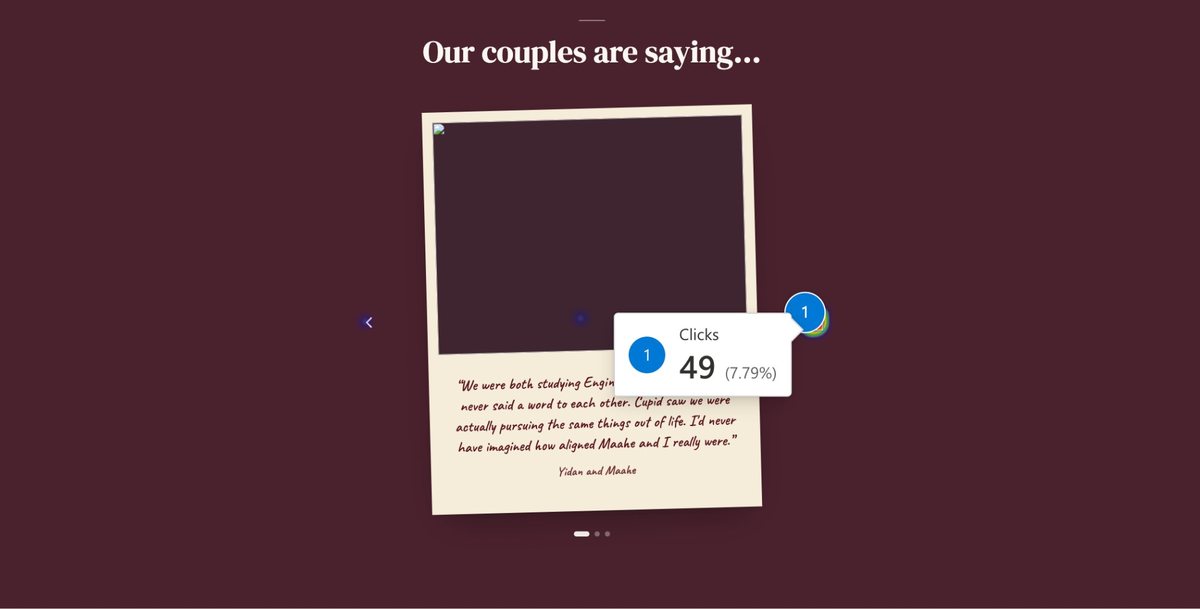
A Microsoft Clarity click map over the old testimonial carousel, with a marker on the next-couple arrow reading 49 clicks, 7.79 per cent
Clarity click heatmap on the previous site, desktop.

I put the couples on one screen.

The most-clicked thing on the homepage was the arrow to the next couple. 49 clicks, 7.79%, against 20 on the main call to action. People were hunting for more proof that real human beings had done this, so I built them a wall of it.

The cards open now.

Dead clicks sat at 10.87% across 598 sessions, on the testimonial cards. People were clicking the photograph expecting it to open, so I gave it something to open.

Photographs took over from paragraphs.

People travelled 83% of the page in 1.4 active minutes, and 90.81% had never been before. The homepage carries the argument alone, to somebody moving fast.

Two samples. The click percentages come from the desktop click map; the session figures are the whole site over ninety days.

So I cut the copy back, gave the real cases the room the copy had been taking, and made that part of the page something you move through rather than read.

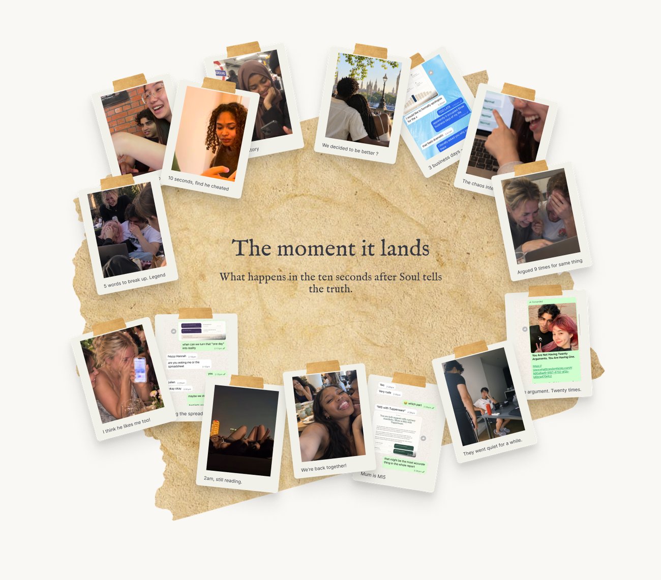
A wall of Polaroid photographs pinned to torn paper, headed 'The moment it lands'. Each one shows somebody reading their report, with a short caption
The moment it lands. The ten seconds after Soul tells the truth.
The rest of the second version’s decisions
  • Paper, a wax-dark envelope and a quill. The product started asking for something much heavier, and the letter points at the last time people got to know each other slowly, by writing.
  • The envelope opens on the page. Curiosity is the way in, so somebody can see what the report looks like before they sign up for anything.
  • The numbers sit on torn paper tape. It keeps them inside the world of the letter and away from looking like a dashboard.
  • The universities are set in a handwritten face. Same world, and it keeps institutional proof feeling personal.
  • The Polaroids are held down with tape. They read as something a person put there.
  • The privacy terms sit on three paper cards, in the same visual language as everything else. A promise that lives in the world of the product is more believable than one in the legal small print.
  • The wall is sorted by family, friendship, relationship and situationship. More people find themselves in it, which lowers the bar to uploading.

The current site, screen by screen

Every part of it is answering something the research or the data turned up, so here is each one and the reason it looks like that.

The hero of the current site: a question as the headline, and a card showing how to export a WhatsApp conversation
The first screen asks a question and then shows you how to answer it. The headline is what Soul is seeing in your relationship, and the card underneath walks through exporting the chat. Somebody who is curious can get from the question to the upload without leaving the screen.
Two counters on torn paper tape: total chats analysed, and reports made today
The counters run live, on torn paper tape. “Plenty of people do this” is something a visitor can watch rather than take on faith. The tape keeps the number inside the world of the letter, away from looking like a dashboard.
An envelope on the page with the report sliding out of it
The envelope opens on the page. You see what the report actually looks like before you hand anything over. Curiosity is the way in, so the product shows itself before it asks.
A row of London university names set in a handwritten face, under a line about who built it
The universities are handwritten. Institutional backing is the most checkable proof we have, and setting it in a hand keeps it personal. It reads as people you could know, rather than logos on a wall.
The wall of Polaroid photographs, taped down on torn paper
The wall is taped down, and sorted by what the relationship was. Family, friendship, relationship, situationship. More people find themselves somewhere in it, and tape reads as something a person put there rather than something a marketing team bought.
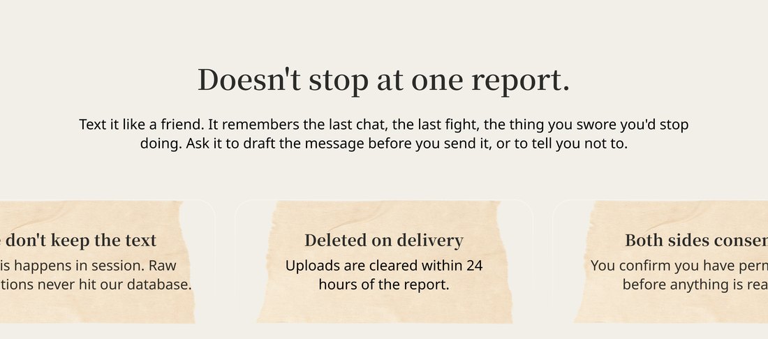
The section saying it does not stop at one report, with three paper cards carrying the privacy promises
It does not stop at one report, and it says what it keeps. You text Soul like a friend and it holds the last conversation, the last argument and the thing you keep walking back into. It will draft the message before you send it, or tell you not to. The three privacy promises sit on paper cards in the same language as everything else, because a promise that lives inside the product is more believable than one in the small print.
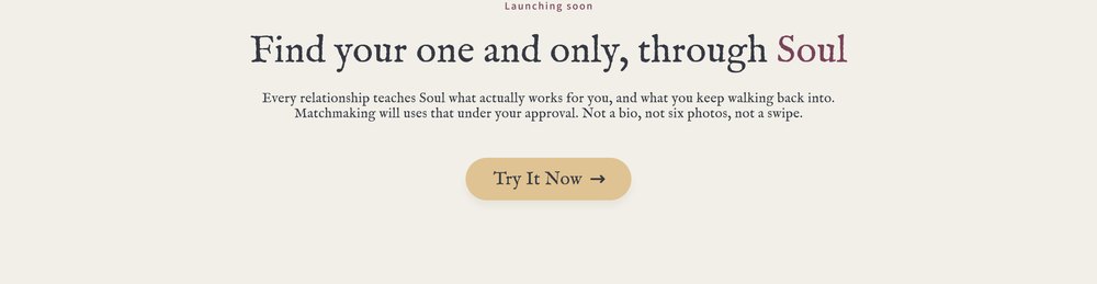
The closing section: find your one and only, through Soul, with matchmaking marked as launching soon
Matchmaking comes last, and it is honest about waiting. It is marked as launching soon, and it says what it will use: everything the reports taught Soul about what works for you, under your approval. Not a bio, not six photos, not a swipe.

The whole of it, as it shipped.

The full 1soul.ai homepage from top to bottom: the quill hero, the report in an opened envelope, the row of London universities, the wall of Polaroids, the three privacy promises and the closing call to action
1soul.ai, top to bottom. Scroll inside the frame. I designed it and built the front end.
Trust, as things you can point at
  • Matches arrive one at a timeA queue is the thing that made her feel like stock on a shelf.
  • Cupid sending a short preview of a match, a few details at a time She gets a clue, and the profile stays closedEnough to be curious with, and it leaves the rest for her to find.
  • She replies in her own timeUrgency is what makes these products feel unsafe.
  • Cupid's onboarding message stating that the user is always in control "You decide what you do, always", written into the onboardingA product that will not say it in words does not mean it.
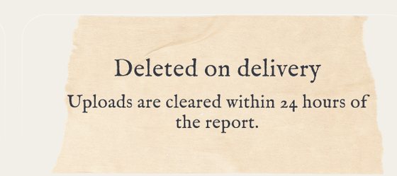
  • A card on the site reading 'Deleted on delivery. Uploads are cleared within 24 hours of the report.' Raw uploads deleted within 24 hours, stated on the pageThe promise is worth as much as the sentence that carries it.
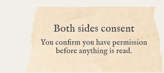
  • A card on the site reading 'Both sides consent. You confirm you have permission before anything is read.' Both sides consent before anything is readSomebody else is in that conversation too.

What we keep, and for how long

Analysis happens in session. The raw conversation never reaches our database, and the upload is cleared within 24 hours of the report going out. What survives is the report and what Soul learned about you, which is the part you asked for.

Deletion

Deletion is the default. Nobody has to go and find a setting. The 24-hour window exists so a failed report can be regenerated without asking somebody to upload their conversation twice.

Consent

Somebody else is in every conversation that gets uploaded, and they are not the one who pressed the button. So the flow asks the uploader to confirm they have permission before anything is read, and the site says so on the page itself.
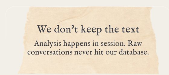
A card on the site reading 'We don't keep the text. Analysis happens in session. Raw conversations never hit our database.'
All three promises sit on the homepage, in the words a person would use.

The line that did not move

Across both versions one rule held. The AI works in the background and the person stays in the foreground.

The first version's clue section: Cupid sends one hint about a match and she replies, under the line 'You decide what you gonna do, always'
Round one: the clue. Soul narrowed the field and handed her one detail. She worked the rest out herself, in a room full of people. The old site said it outright: Cupid works in the background, you stay in the foreground.
A section of the current site headed 'Doesn't stop at one report', explaining that you can text Soul like a friend, ask it to draft a message before you send it, or tell you not to
Round two: the argument. The report is a reading, and you are invited to text back and disagree with it. Soul says what it found. She decides what it means.

Two products, one rule. That is the part I would bring to anything else.

What came of it

Round one had one job: get the women who signed up to walk into the room. It worked.

Round two has a harder one. Get somebody to hand over the conversation they would only show a close friend. Over 5,000 people are using it now.

That number is the measure of the trust work. Every one of them read what the product was asking for, decided it was safe, and went and found the export button.

The second proof arrived on its own. People started sending their reports on: to a friend, into a group chat, to the person the report was about. Somebody who shares theirs has trusted it twice, and the second time is the harder one to earn.

Sharing brings in people who arrive already warm. The product started recruiting for us.
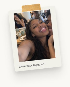
One Polaroid from the wall: two people laughing together over a laptop, captioned 'Argued 9 times for same thing'
Every one of these was sent to us.

The first rung is where I am now, building the part that has to hold before any of the rest works.

How I work

I run and write up the interviews myself. The clustering, the cross-checking and the building run through AI, and the judgement stays with me.

Who did what, on this project

The closer the work sat to a person, the more of it I did by hand.

  • By hand. Eight in-depth interviews with London students and heavy app users. Every one run and written up by me.
  • AI extracted. Transcripts clustered by problem type. Eight areas, with brand tone and trust for women at the top.
  • AI cross-checked. Claude, ChatGPT and Gemini on the same material in parallel, so a gap between them showed what one had missed.
  • AI attacked. I had it read the site as a sceptical first-time visitor. It found what the interviews had, which is how I knew the finding held.
  • My judgement. The mechanic. She gets a clue first, and the decision stays hers. That came from sitting with one participant's discomfort.
  • AI built. Positioning into copy, copy into Figma, Figma into shipped code.
  • Measured. Female sign-ups up 25%, users more than tripled.
The full loop

Stage by stage

  • Claude, ChatGPT and Gemini, in parallel. The raw interview material through all three at once, cross-checking their reads, so anything a single model missed shows up as a gap between them.
  • Claude. Research synthesis. Transcripts into a prioritised framework in hours, then positioning and copy grounded in that evidence.
  • Claude to Figma. An approved direction into an editable file, so spacing, hierarchy and imagery stay reviewable before anything is built.
  • Claude Code. The real thing. The front end shown on this page was built in code, well past the mockup stage.
  • GitHub and Vercel. Every round is a reviewable change, and a design decision can ship the same day.
  • AI again, after launch. Re-checking copy, flows and edge cases against how real users respond, which feeds the next research round.

The whole loop, on its own page →

The AI moved fast on everything downstream of a decision. It never made the decision.

Want to try 1Soul?

Sign up here ↗
← Xiaomi Auto Huawei →