
Project overview
Designed and built the Innovate ADHD digital platform from 0–1, improving access to ADHD assessment and support in the UK. The project focused on simplifying complex healthcare journeys and making information more accessible for neurodivergent users. By combining clear information architecture with engaging, low-cognitive-load interactions, the platform supports users from awareness through to booking and care.
My contributions as the product manager
- Led end-to-end UX and service design, from research to delivery
- Translated complex clinical information into clear, user-friendly content
- Designed user journeys to reduce drop-off and improve engagement
- Collaborated with clinical and development teams to align design with real service delivery
This project explores how design can better support people with ADHD in managing focus and daily tasks, where most existing tools tend to be too complex or not aligned with how attention actually works in real life.
I led the product design from 0 to 1, including user research, behavioural insight, interaction design and UI, while also working closely with engineers on implementation, including AI-driven prototyping (vibe coding) and refining how the product translated into a working system. I was responsible for defining the product direction and ensuring the visual and interaction design could be effectively shipped and scaled.
Alongside product work, I also contributed to marketing and early growth, helping shape how the product was positioned and communicated. Before I left the project, it had already reached and maintained an active user base.
The final outcome is a simple, behaviourally informed product that reduces friction, supports task initiation, and helps users stay more consistently engaged in their daily activities.
1 · The situation: a form almost nobody with ADHD finished
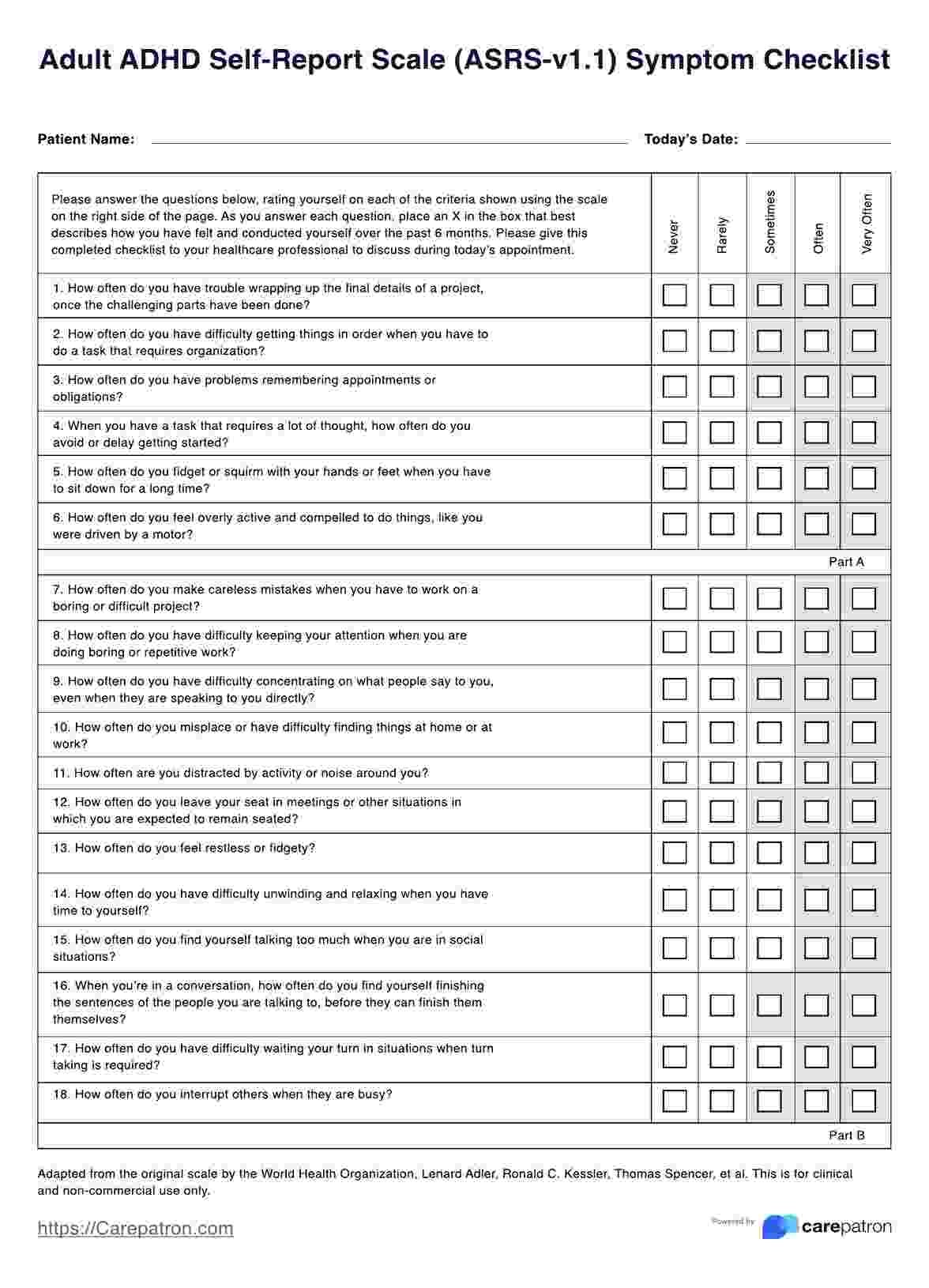
People with ADHD often struggle to complete traditional assessments due to attention challenges, cognitive overload and long, text-heavy questionnaires. This leads to:
- High drop-off rates during screening
- Incomplete or inaccurate self-assessments
- Delayed access to diagnosis and care
The key challenge was: how might we redesign essential clinical questionnaires so users can actually complete them?

2 · My solution: gamification
I redesigned traditional ADHD assessments that were often long, repetitive, and difficult for users to complete, which led to drop-offs and low engagement. Many users felt overwhelmed by the length and cognitive effort required, which reduced the reliability of completion.
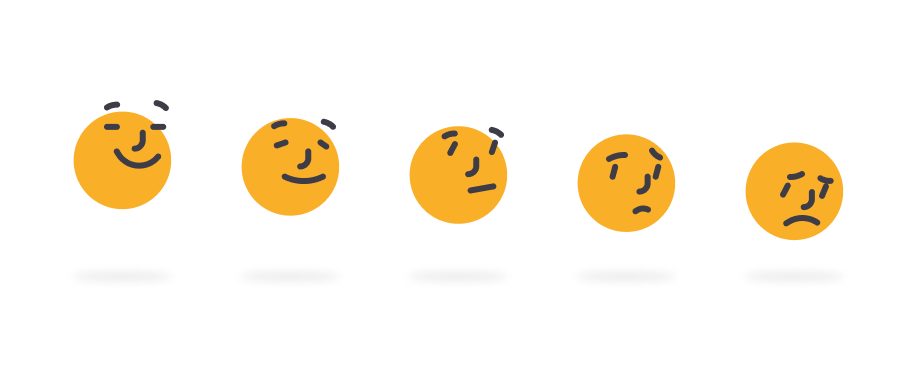
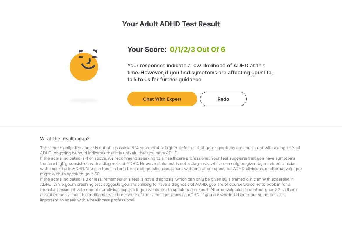
I broke the assessment into bite-sized, gamified modules that felt engaging and low-pressure while preserving clinical accuracy, turning heavy, repetitive text into an interaction that felt more like checking in with yourself than sitting an exam. This improved user engagement and significantly increased completion and conversion rates, without compromising the validity of the assessment.
AI in the workflow: a tool chain, not a gimmick
The two-week concept-to-live timeline only worked because AI sat inside a deliberate pipeline, not as one-off novelty: prototype fast, build with AI in the loop, use AI again to check the work before real users ever saw it, then stay hands-on in the code myself.
AI-driven build & delivery: I led an AI-driven workflow, using vibe coding alongside Figma prototypes to work closely with developers, rapidly translating ideas into functional features. This allowed us to iterate quickly and move from concept to a live product within just two weeks.
AI-enabled validation: I then introduced AI as a second layer of validation, using it to test usability, interaction clarity, and overall user experience. This helped ensure the product was not only functional, but genuinely intuitive and user-friendly before reaching real users.
AI-assisted implementation: I used Claude to directly refine and modify developer-written code, enabling me to stay hands-on beyond design and ensure the final implementation precisely matched the intended user experience.



3 · Updated the design system: designing for ADHD cognition
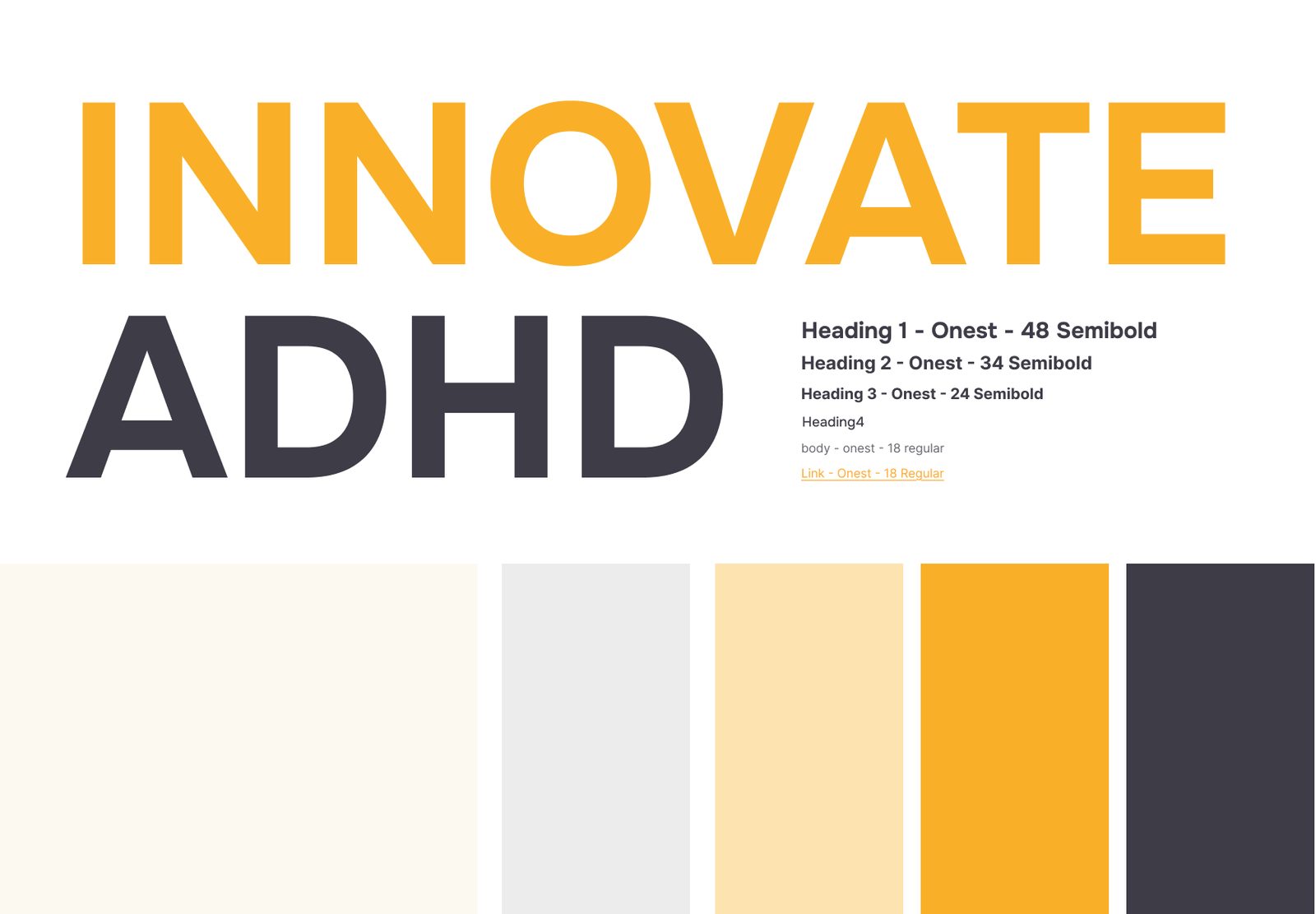
The problem I found: the site had been designed the way most sites are designed, for a neurotypical reader. Restrained contrast, small type, dense paragraphs, subtle links: the visual language that usually reads as tasteful. For this audience it's the opposite of accessible. A design that asks you to hunt for the next step is asking for exactly the executive function ADHD makes expensive, which is the same trap the original assessment fell into.
So I rebuilt the design system around what this audience actually needs, not what looks understated:
- Bolder, higher-contrast colour instead of muted neutrals, so the eye lands where it should without effort
- Unmistakable visual guidance: one clear next action per screen, progress made visible, and the path through the flow never left to inference
- Larger type and more generous spacing, trading information density for readability
- Fewer distractions: unnecessary animation and decorative movement stripped out, so nothing competes with the task
Attention-focused design for ADHD users: I designed the platform specifically around ADHD user needs, creating a more focus-friendly and cognitively accessible interface. This included larger, more readable typography, a clear and guided structure, reduced distractions such as unnecessary animations, and a strong visual hierarchy to help users stay on track. Compared with conventional UI patterns, these choices intentionally prioritise clarity and attention over density and aesthetics.
These design decisions were grounded in accessibility and cognitive principles, aiming to reduce cognitive load and better support sustained attention. The overall experience was also validated through accessibility checks, including contrast and readability standards, ensuring it aligns with established guidelines while being genuinely usable for this user group.
4 · Results: completion, conversion, engagement
The number that mattered most
The whole project rested on one question: would people with ADHD actually reach the end of an ADHD assessment? Page views tell you the marketing worked. Completion tells you the design worked. That's why the engagement rate is the figure I watch: 82%+ of visitors interacted rather than bounced, on a page whose entire job is a task the audience is known to abandon.
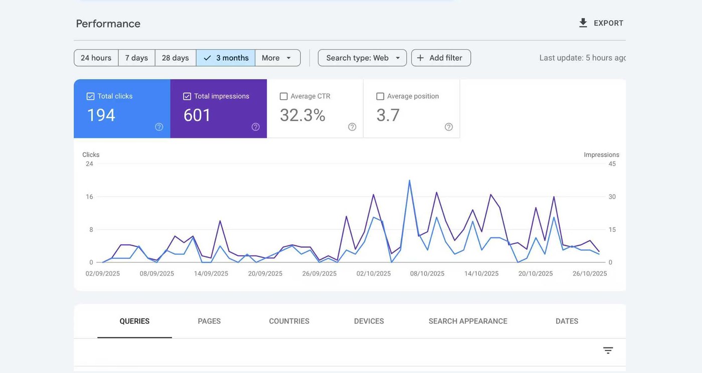
The rest of the numbers are early-stage, and I'd rather say so than dress them up. 1.3K+ page views and 600+ unique users, with no marketing spend, tell me the positioning found people. A 32.3% click-through rate at an average search position of 3.7 says the ones who found it were the right ones, not incidental traffic. What none of it proves yet is clinical outcome, which needs a longer run and a controlled comparison against the original form.
"The logic is really clear, and the thing that made me happy is that I actually finished the basic ADHD test. I like it. It's genuinely fun."
That one is worth more to me than the analytics. It came from someone on our own team who has ADHD, testing the flow as a user rather than a colleague, and it names both things the redesign was aiming at: the structure was legible, and finishing felt good instead of exhausting. Enjoyment isn't a soft metric here. For this audience it is the completion mechanism.

What I'd do next
Before I left, the product had an active user base and better completion and conversion than the original flow. The obvious next step is the one I didn't get to: instrument the assessment itself, question by question, so drop-off can be traced to a specific screen rather than inferred from a page-level number, and run the gamified version against the original form with real users on both sides. That turns "engagement improved" into a defensible claim about clinical completion.